Making Facsimiles Readable
To make these facsimiles more user-friendly, I have had to do a great
deal of cleaning up on them. Facsimiles usually contain a great deal of
noise, in the form of dark areas,and ugly dots and blotches. The
purpose of the clean-up is to make the facsimiles more readable by
improving the signal-to-noise ratio.
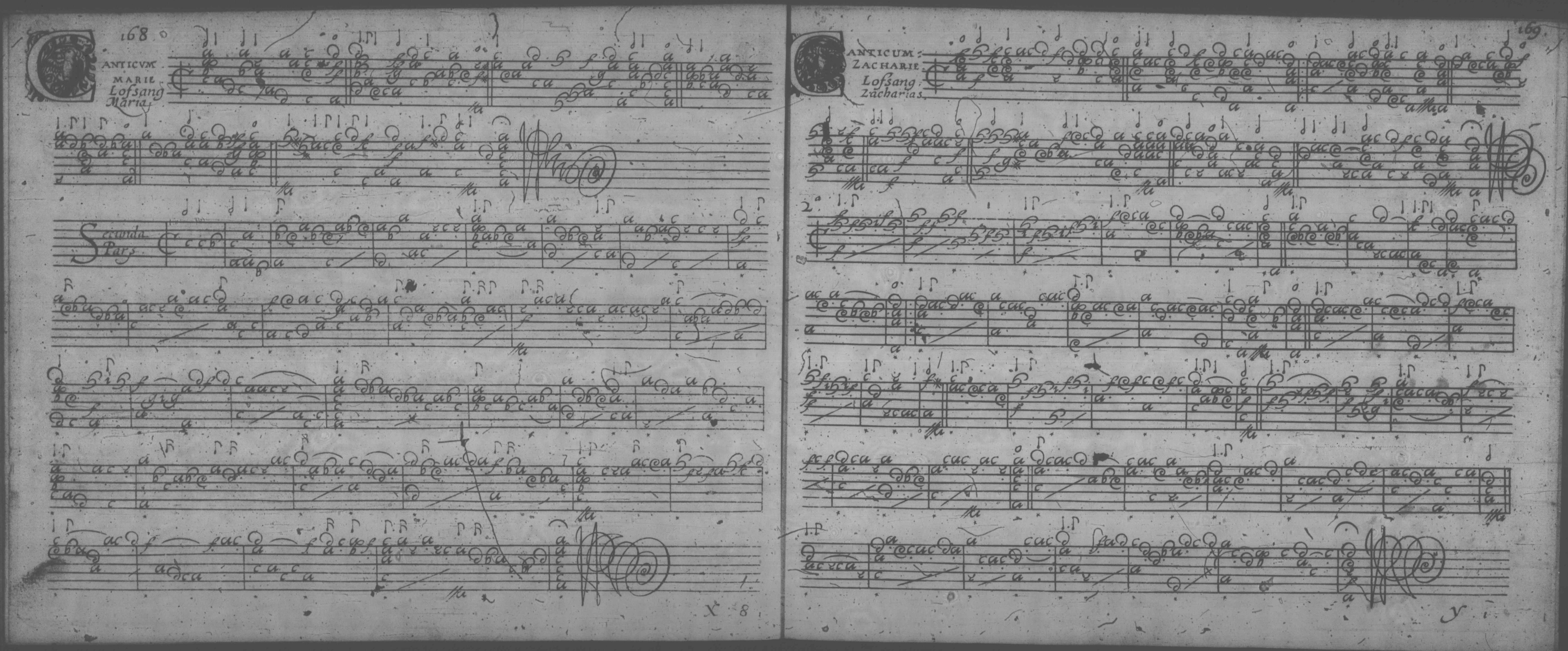
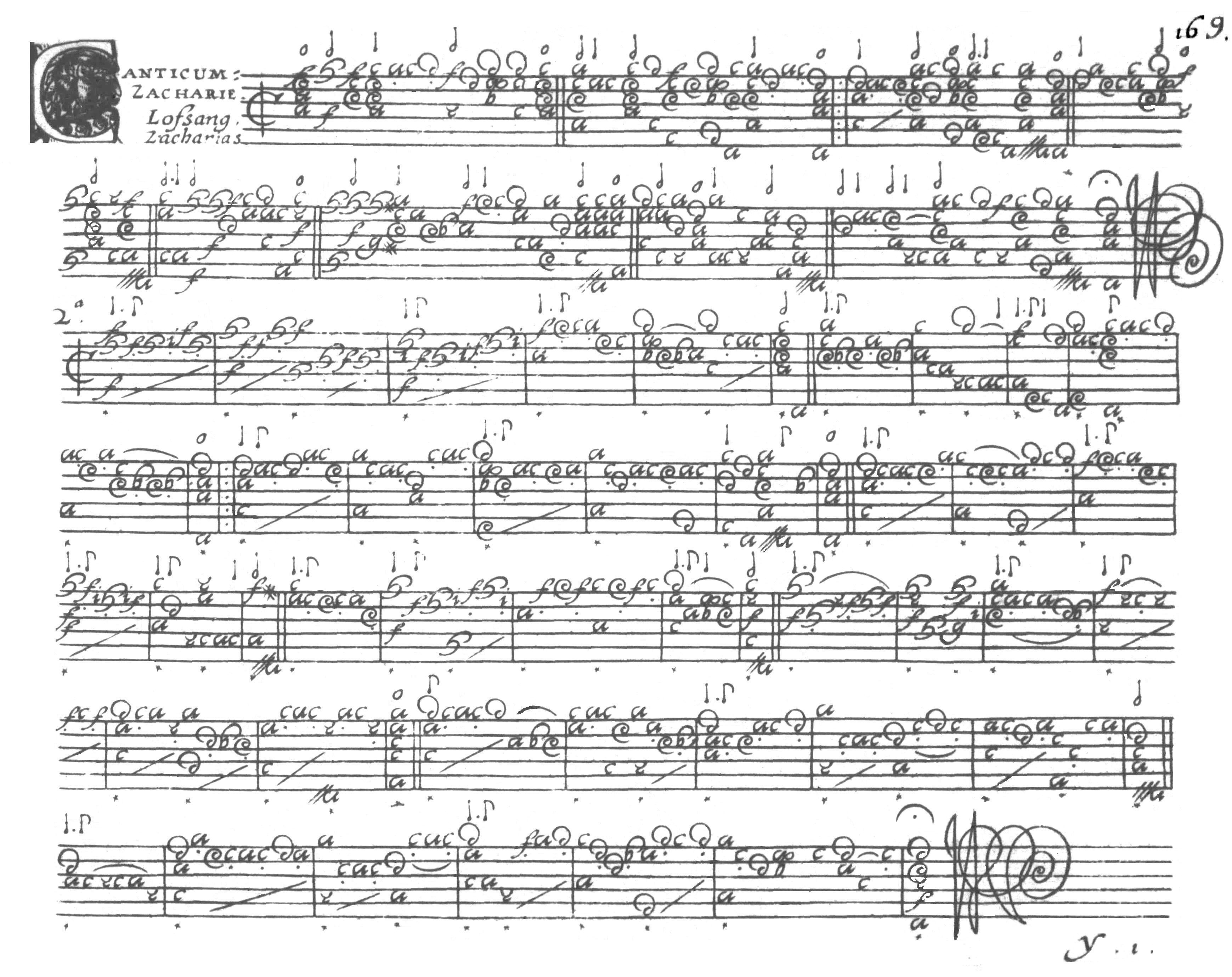
I start with a microfilm copy, which I then scan in greyscale,
resulting in tiff or jpg images. The result looked like this for
the last page of Vallet's Psalms of David:
Often, the microfilm is a little skewed at the edges, as the original
was bent away from the camera. Also, sometimes a bit of the edge
detail and, very rarely, a note on the edge is lost. Also, the
page is usually not perfectly aligned on the microfilm, so the staff
lines go at an angle.
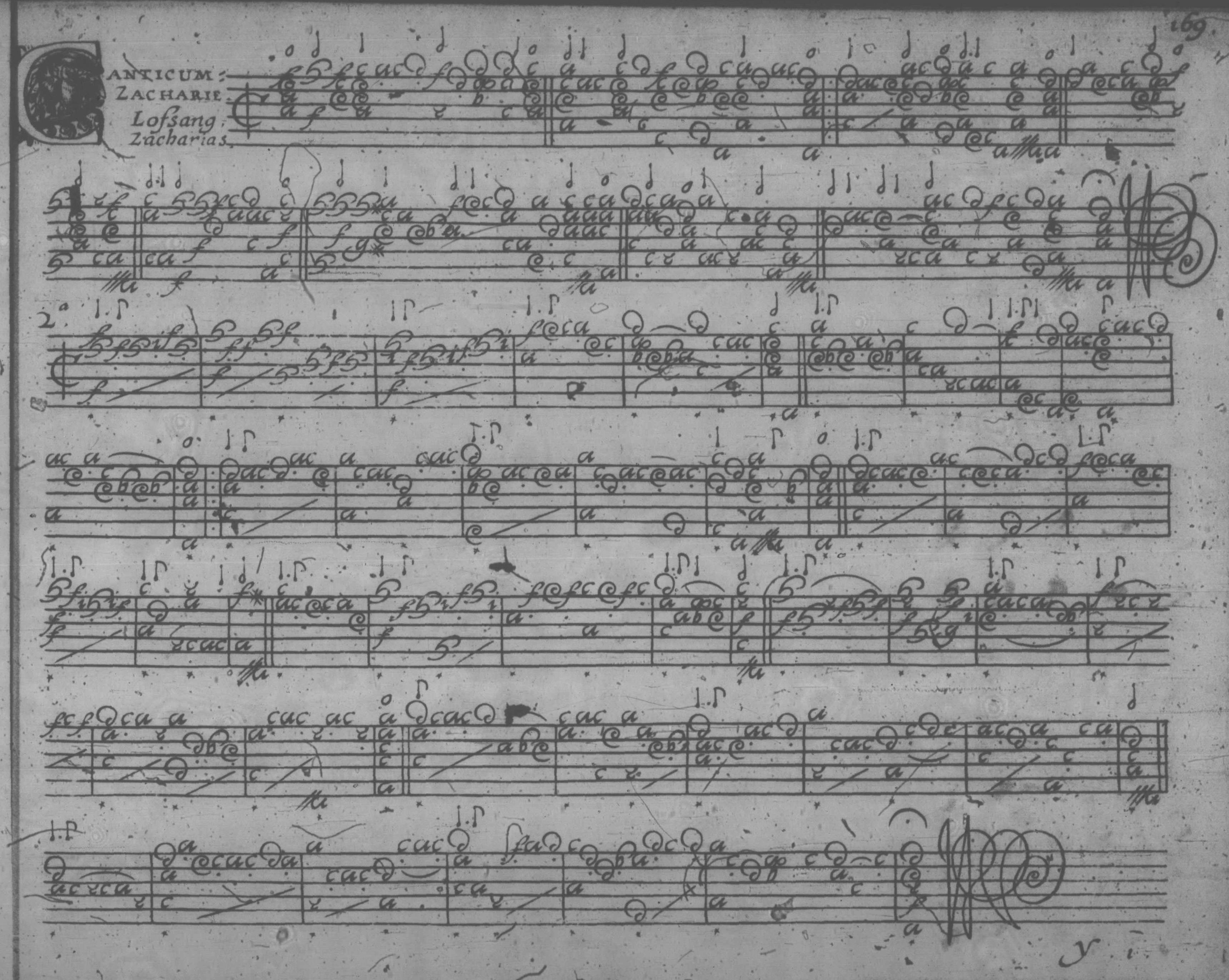
The first step of the cleanup process is to read the file into a
user-friendly editor. I use PaperPort, but any good editor should
do. I first straighten the image and crop it, so as to have a
single page per file, with acceptable margins. It then looks
like this:
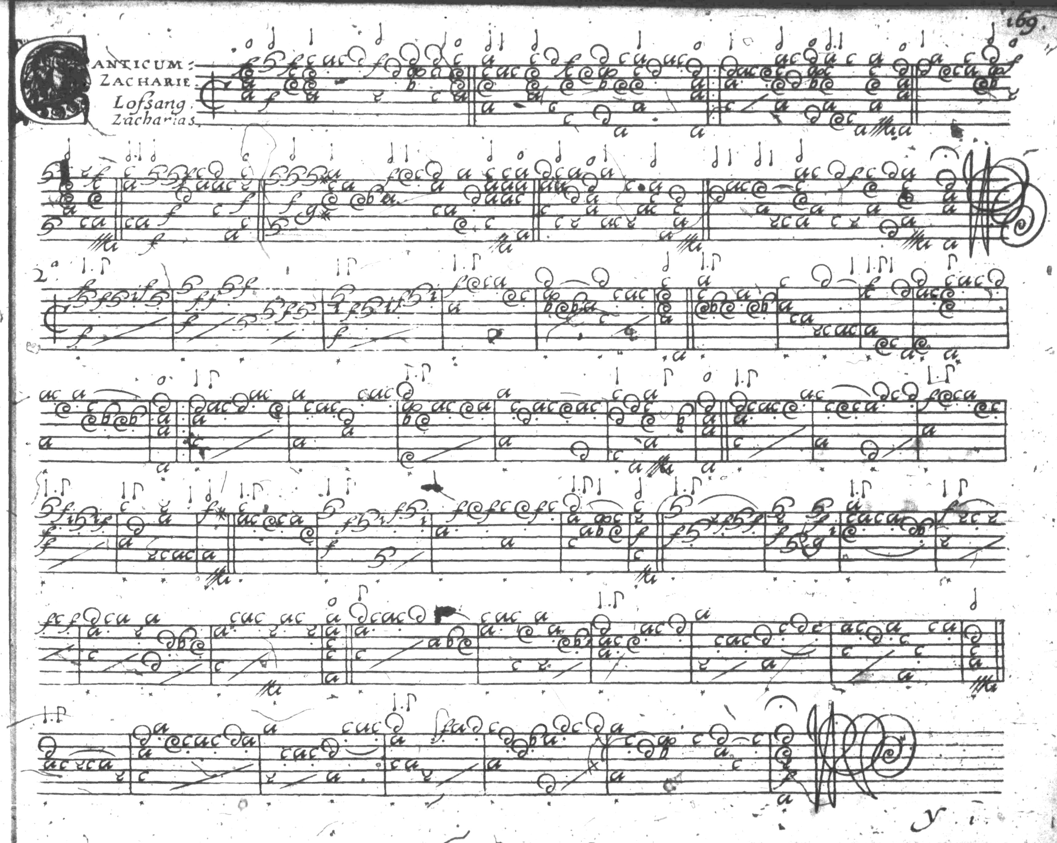
The next step is to adjust the brightness and contrast for maximum
readability. Many scans have different degrees of brightness and
contrast in different parts of the page. The settings are a
compromise between being too washed out and having dropouts at too low
contrast and too high brightness, and having areas that have too much
dark "noise" at low brightness and high contrast. The latter are
very time-consuming to clean up, requiring you to "excavate" the
meaningful stuff from the grungy noise, but in order to have readable
copy in other areas of the page, sometimes one has to bite the bullet.
I suppose a more sophisticated editor might be able to adjust
brightness and contrast differently in different parts of the page, or
even compensate for any skew that is present, but these are beyond my
means and ability at the moment. The result of this step looks
like this:
Next, I clean up the margins so what remains looks like a regular page:
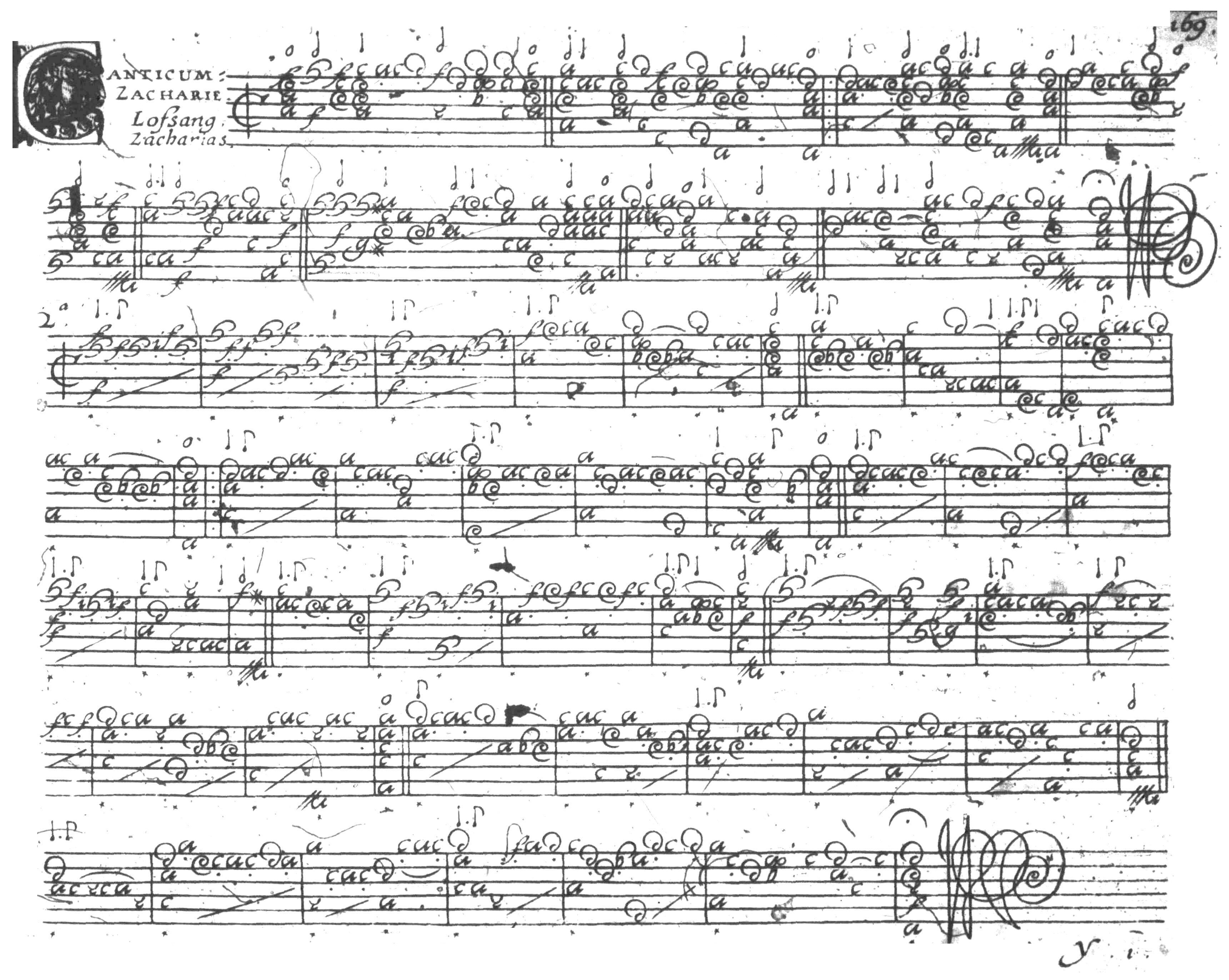
The above is fairly easy, and if I were to stop here, the page would be
much more readable than it was at first. But it would be hard
going, because of the blotches that obscure some of the notes, the
drop-outs, and especially the random dots that compete with the
meaningful dots in a confusing way: right-hand fingering dots, dots on
note values, and other dots that are tenuto marks. Also, Vallet
makes ample use of slurs. All these can be perfectly mimicked by
noise dots. It is therefore necessary to make some judgment
calls. If a rhythm flag has a dots next to it, the next note
almost always is
flagged 1/2 or 1/4 the value of the dotted note, if it's a real dot.
The only exception would be if there is a continuing triple
meter. This is fairly rare, and it's pretty obvious when it
happens. If it's a right-hand fingering dot, it almost always is
on a non-accented note. There are exceptions, but very rare, and
none that I could find in Vallet. Also, these dots are less
common on the lower courses (below the 4th course). Slurs that
aren't really slurs usually have a grayed-out look, but not always.
For notes that are obscured or dropped out, one has to make a choice
whether to make an educated guess about what should be there or to
leave the blotch or drop-out in place and let the reader choose.
For this kind of thing, I always keep a lute handy and play all of the
possibilities. Almost always all but one result in a hideous
sound. So then I know what it has to be.
In all of these editing decisions, there is a tension between being
musicologically safe (leaving the defects in place) and providing
readable copy for the player (correcting the defects). The result
is a page that looks like this:
All the steps through cleaning up the margins is fairly easy. The
other steps are enormously time-consuming, and I don't think my life is
long enough to do all of this for all my source materials, so for
the future, I will probably just clean up the margins and leave it at
that.